Naima's Published Titles

Showing posts with label Photoshop tricks. Show all posts

Thursday, March 13, 2014

Lighting Pallas: A Photoshop Trick

I recently altered some photos for a cast-of-characters animation on my site thebaddeath.com (the landing page for The Bad Death, the first in a historical trilogy and the second in the 
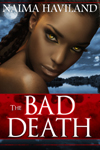
Bloodroom series of vampire novels). This blog post explains some tricks I used in Photoshop to make an image more atmospheric. First of all, meet Pallas, as pictured in the image I got from 123rf.com. Pallas is the best friend of the trilogy's heroine, Anika. Pallas is either a victim, a predator, or both. To know for sure, read The Bad Death  ;-)

Once in Adobe Photoshop, I used the Apply Image feature to replace the black backdrop to an image of an outdoor setting. To learn more about this step, read my post called A Photoshop Trick for Book Marketing. After Applying the image to Pallas, I decided to change the lighting on Pallas' image. You see the image above shows the woman in warm lighting. I wanted Pallas to look moonlit because in The Bad Death, Pallas is almost always sighted at night.

To cast a blueish moonlight glow over Pallas, I selected Image from Photoshop's top menu, scrolled the dropdown menu to select Adjust, then chose Variations at the bottom of Adjust's dropdown menu. The Variations pallet visually shows color adjustments. I chose "More Blue" and "More Cyan" to give Pallas a blue cast that would imply moonlight.
I wanted to make the moonlit sky more dramatic, so I copied the layer, cut out Pallas till I had only the sky on the copied layer, then used the blending feature of that layer to alter the sky. The blending feature causes the layer in question to react against the layer beneath it to produce a visual effect. If memory serves, I chose the Hard Light blending option. You can see in the third image how Pallas' background has more contrast between highlight and shadow, resulting from my choice of blending option.

So, there you have it, boys and girls!

Sunday, September 15, 2013

A Photoshop Trick for Book Marketing

I have cast-of-character strips on my book web pages, bloodroomthenovel.com and thebaddeath.com. They give potential readers a chance to read bios of major characters. Also, the individual images give me visual aids to use in marketing my books. For instance, I'll post an individual character on Instagram with a provocative tagline and the web addy. Adobe offers a monthly subscription for Photoshop for less than $20/month, but you could probably find a good price on eBay or somewhere if you want to own it outright.

At left, you'll see the image I purchased at istockphoto.com has a dark background. Derek Murphy of Creativeindie Covers used this graphic to produce the cover for The Bad Death. At the time, I didn't have a large file of Derek's work. I used a jpeg of the cover in progress, pictured right. To change the model's brown eyes to my heroine's gold, I used Photoshop's marquee tool to select the gold eyes from Derek's small file and copied them into my large file, resizing them to fit my stock image.

Then I had to give my Anika the background Derek had. I have a graphic design background, but this trick is easy if you know where Photoshop's interface keeps the right tools.
Since I also bought the blue watery background from istockphoto, I had that large Photoshop image to work with. I opened that image in Photoshop and copied it into my working file. Copying into my working file automatically put the background on its own layer. On Anika's layer, I used Photoshop's pen tool to draw a path around her. See that thin light outline? That's the path.
When you click on the arrow in the Paths palette, a dropdown menu gives you the option to "Make Selection" of the path.

With the path selected, I clicked on Image in Photoshop's top menu. From the Image dropdown menu, I chose "Apply Image". At that point a palette popped up allowing me to select the layer containing the background.

TaDOW!


Friday, July 5, 2013

Dressing Julian


Julian Mouret is a vampire in my contemporary novel, Bloodroom. My upcoming historical vampire novel, The Bad Death, also stars Julian Mouret. Today I took the stock image photo I bought for the cast-of-characters animation on bloodroomthenovel.com and "dressed" it in 18th century clothing for the cast-of-characters animation to be featured on thebaddeath.com. This wasn't quite as fun as dressing a good looking man for real, but it was still pretty fun.

The hottie in the tux is from http://www.istockphoto.com/. The young gent with the pistol is from 123rf.com. My challenge was to get Julian out of his tux and into the sharpshooter's old-timey clothes. I used my Photoshop 6.0.
.I can just hear the hoots of incredulity. Yes, I use 12 year old software! It has all the features I need for simple image manipulation. If you don't have Photoshop, Adobe now has an affordable monthly subscription service for its creative programs.

I'll assume you know very little as I explain what I did here. I copied the sharpshooter into the tuxedo photo, which put it on its own layer so I could manipulate it independently. Really, the dressing trick amounted to resizing sharpshooter's body to "fit" Julian's. I used the pen tool to create a path around the cravat so that I could cut and paste it into its own layer. I used the transform tool to resize the cravat and torso.
To fit the the cravat "around" Julian's chin, I used the lasso tool to free select portions I didn't need and also used the eraser tool. Julian looks awfully fierce about his new outfit. Could be that moody sky; it fortells of vampires on the horizon. I cut the sharpshooter out of the sky and dragged the halves of the sky together. Then I duplicated layers and played with the layers blending feature till I got this moody effect. The blending feature in the Layers palette makes the layer in question "react" to the layer beneath it for visual effect. I include a screenshot of my layers. You'll see the selected layer has blending set to "Soft Light". If you mess with enough layers' blending features they all sort of affect each other, which can make for interesting results.